Working with Charts
Report
Product analytics starts with analyzing user behavior data. Instead of relying on professionals to build some SQLs or reports, Kubit offers several dedicated analytics tools called Report to enable everyone to get instant product insights in a Self-Service manner.
When you go to Report from the navigation menu, you will see multiple types of analysis that you can perform with Kubit. The following will produce charts when executed:
- Query
- Funnel
- Retention
- Prediction
- Path
Create a Chart
A Chart is created every time you click the "Execute" button in Query/Funnel/Retention/Prediction or Path. Also, a couple of other things happen automatically:
- an analysis ID is generated and you can see it in the request URL, e.g. in
https://sbx.kubit.ai/report/query/256962the ID is256962 - a random name is generated for the analysis and you can see it in your query history in the sidebar
- analysis is now saved along with the default chart settings
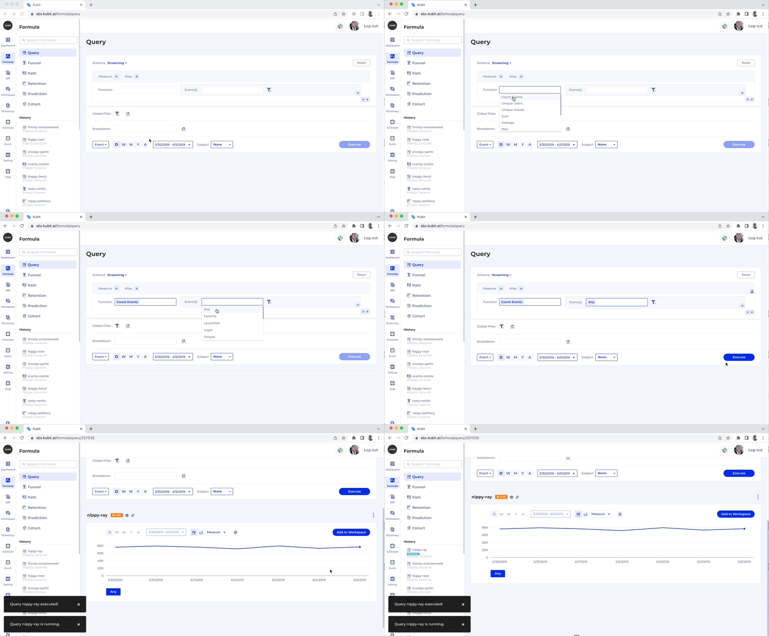
Chart visibility 🔍At this point, only you can see the chart that you just created in your Query History.
Configure Chart Settings
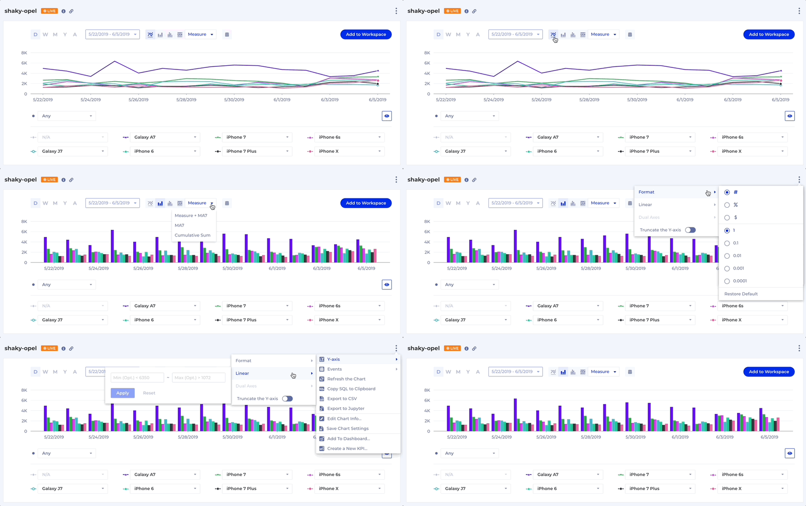
Chart settings include:
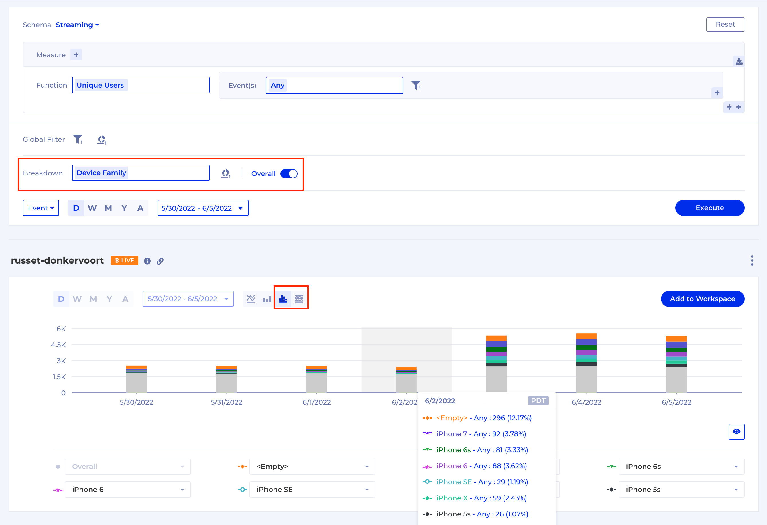
- Type: Bar/Line/Stacked Column/Stacked Area
- Measure: Measure/MA7 (7 day Moving Average)/Measure + MA7/Cumulative Sum
- Groups shown: In case there is Breakdown per group you can decide to hide some of the groups that are part of the results
- Y-axis settings (only for Line chart): Format (
#,%,$,0.1/0.001), Linear, Dual Axis, Truncate
In order to save Chart Settings, go to the Context menu of the Chart and click "Save Chart Settings"
NoteStacked Bar and Stacked Area chart types are only available for single Measures with a Count/Unique Function, when a Breakdown is configured and the Overall toggle is turned on.
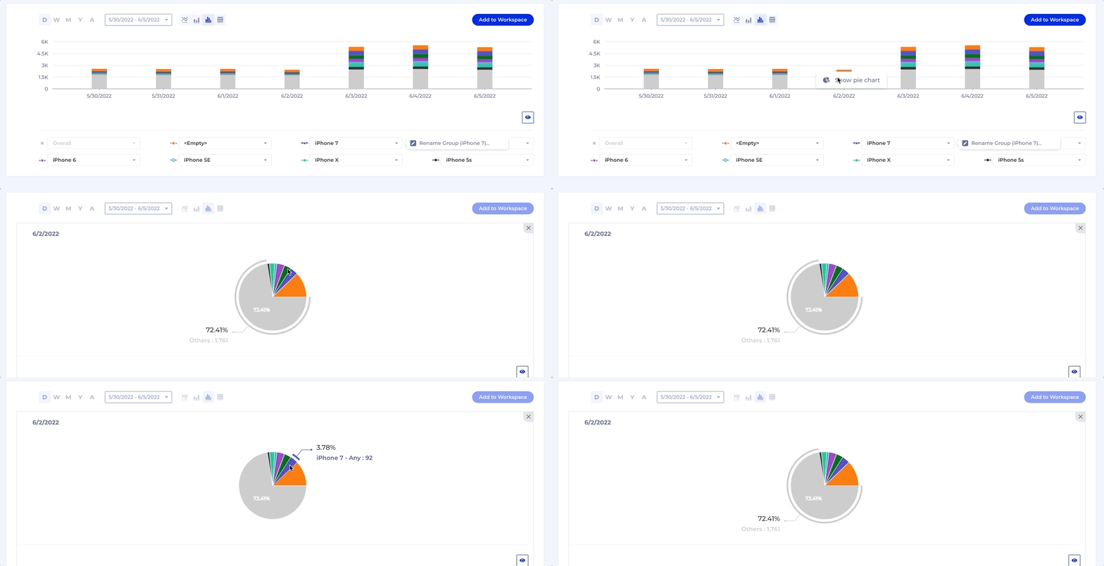
Create a Pie Chart
You can also create a Pie Chart from a Stacked Column or a Stacked Area chart (see more on that in Configure Chart Settings section) by right-clicking over the chart and selecting Show pie chart as shown in the example below:
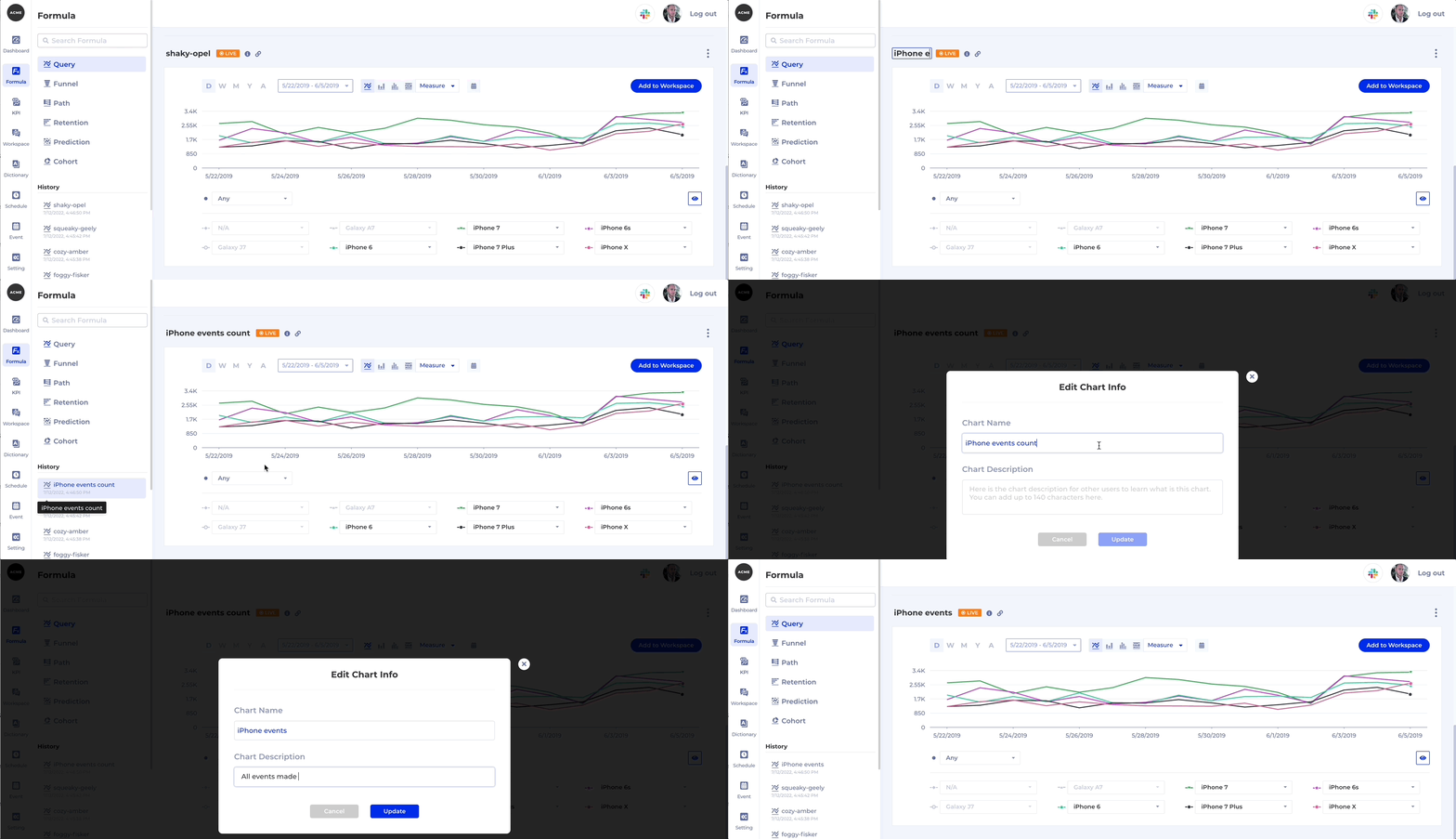
Name your Chart and add a Description
While you don't need to name your Chart while exploring the data, once you have created an analysis you want to keep and share you can give it a meaningful Name and Description. Here's how:
Share a Chart
There are multiple ways to share a chart. Depending on what your goal is you can:
- copy the URL to the analysis and send it over email or a chat
- put the chart on a Dashboard for your whole team to see in the context of other data
- add the chart to a Workspace where you can annotate it and collaborate with your teammates
Add Chart to Dashboard
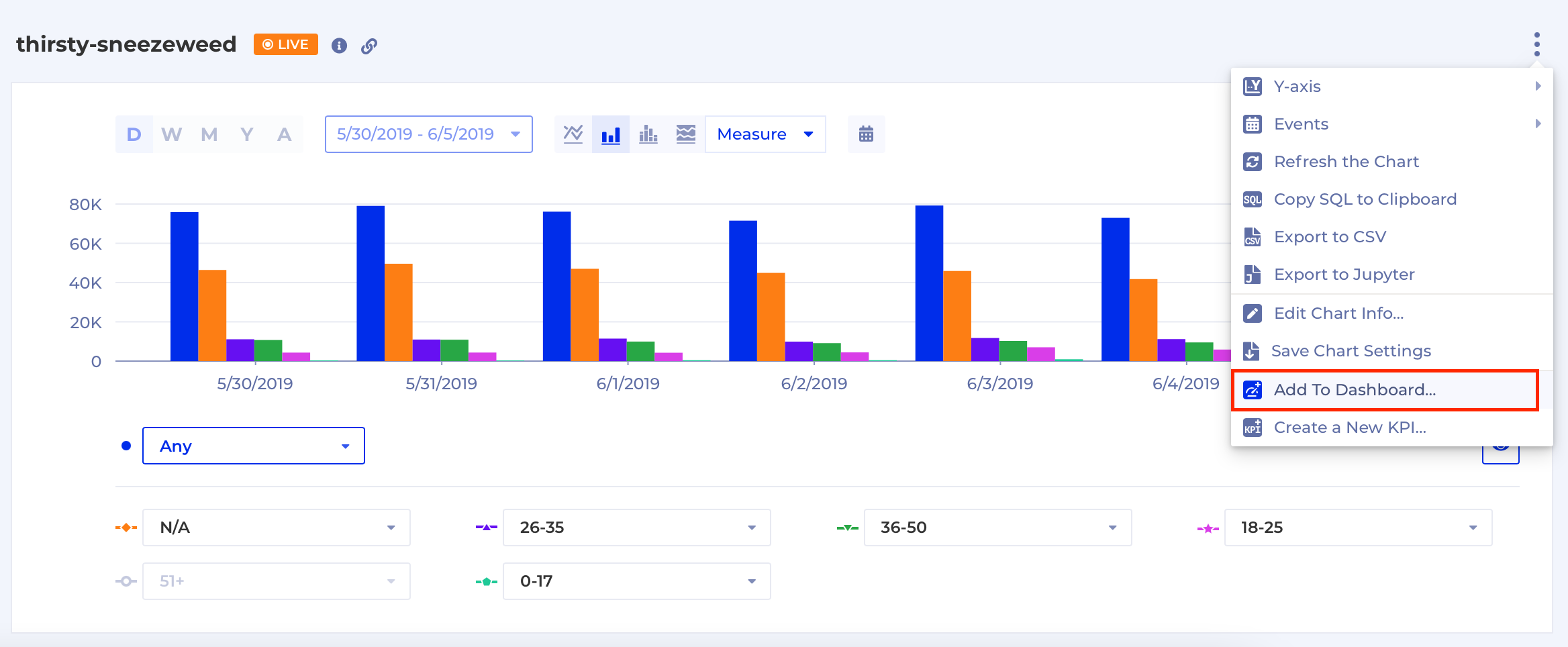
You can add any chart to a Dashboard by selecting "Add to Dashboard" from the Context menu. You can either add it to an existing Dashboard or create a new one that contains this Chart only.
Add Chart to Workspace
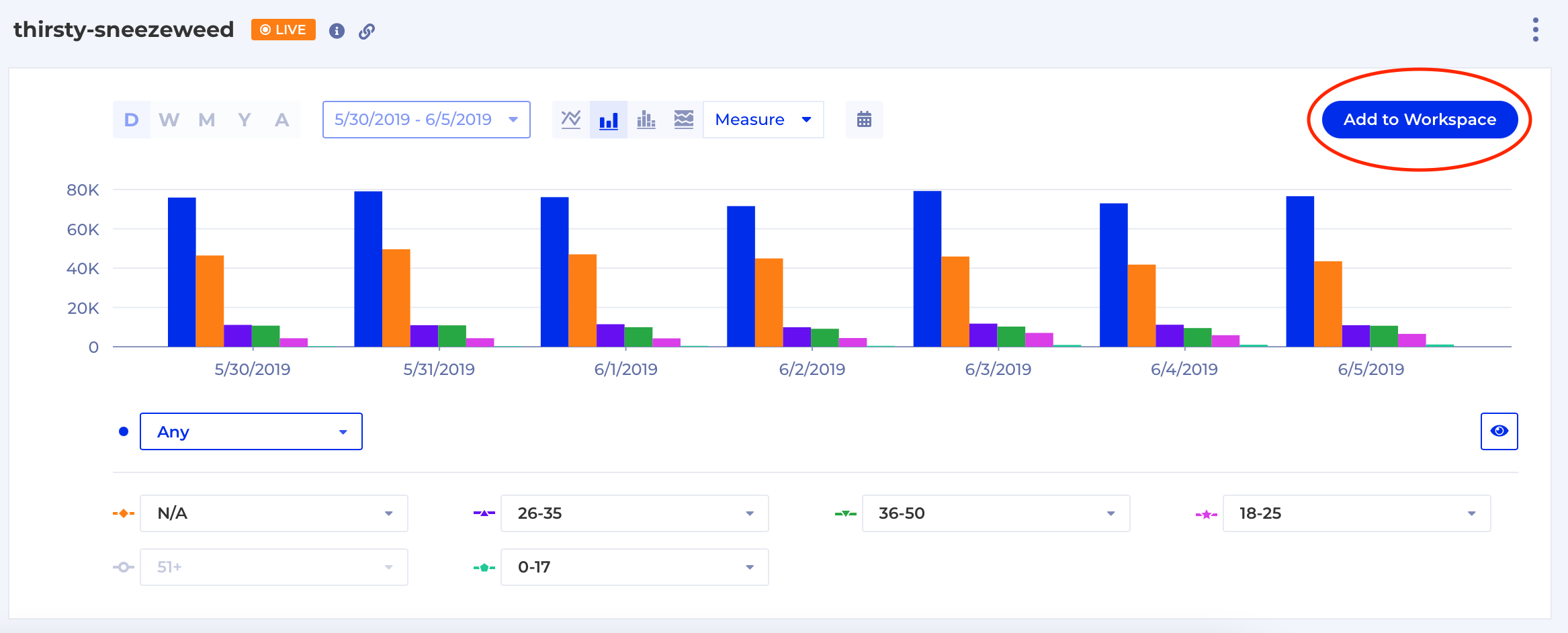
There is a button over the top right corner of the Chart from which you can add it to a Workspace to collaborate with others. Same as adding to Dashboard, you can add the Chart to an existing Workspace or create a new one that contains this Chart only.
Updated 5 months ago