R305 - 2023-06-30
- Inline edit for Charts on a Dashboard
- Disable Events from Data Dictionary
- Percentile filter for Measure and Query based Cohorts
Inline edit for Charts on a Dashboard
We made it easier to adjust analysis parameters for every chart on the Dashboard. The workflow to do it is now as follows:
- You go to the Chart from the Dashboard through the
iicon and then click onShow in Formula.
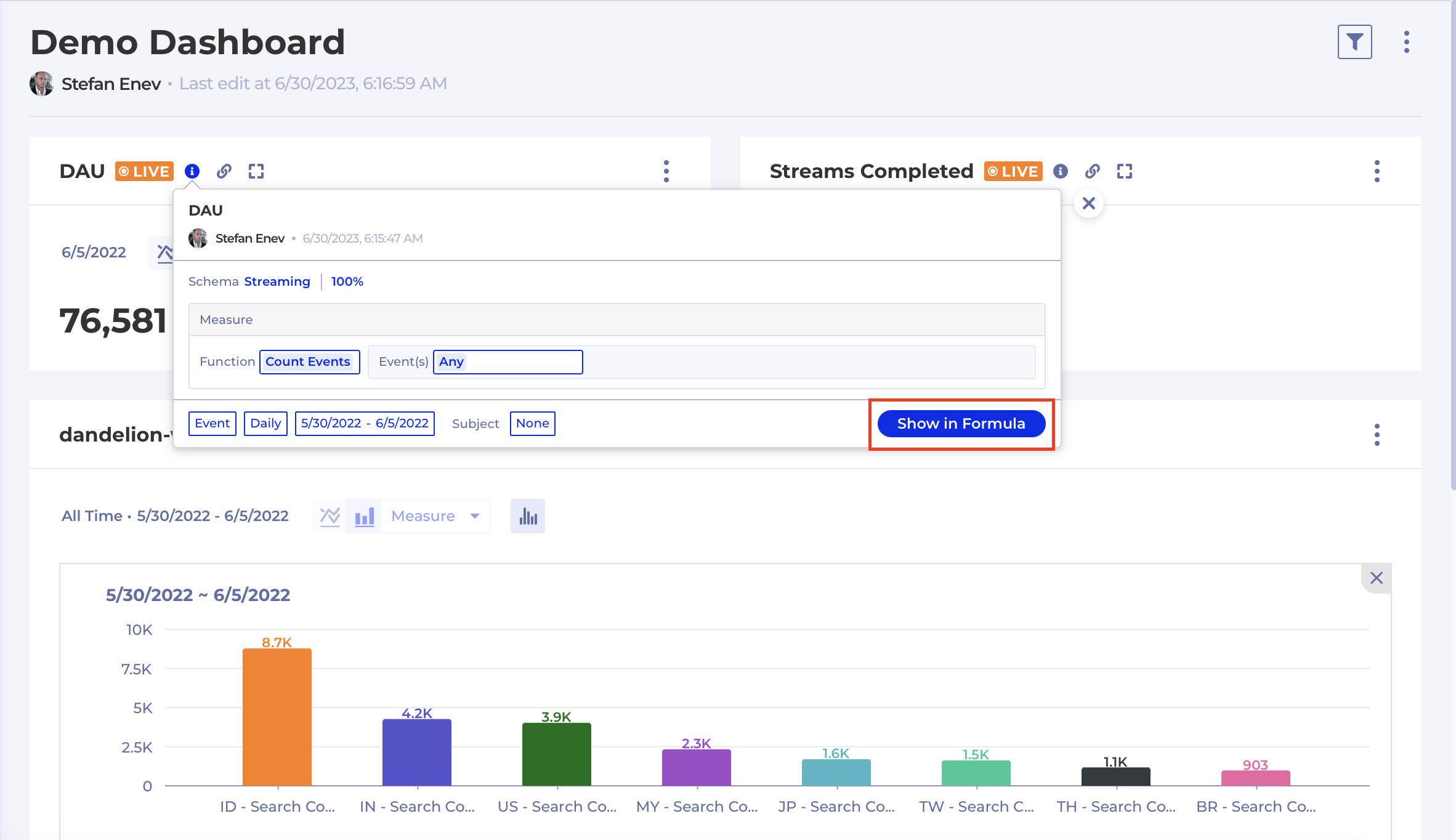
- Make adjustments to the analysis - date range, time unit, filters, breakdown, funnel steps - anything related to the analysis input. Until any changes are made to the analysis input and you've executed the chart the
Replacebutton remains inactive.
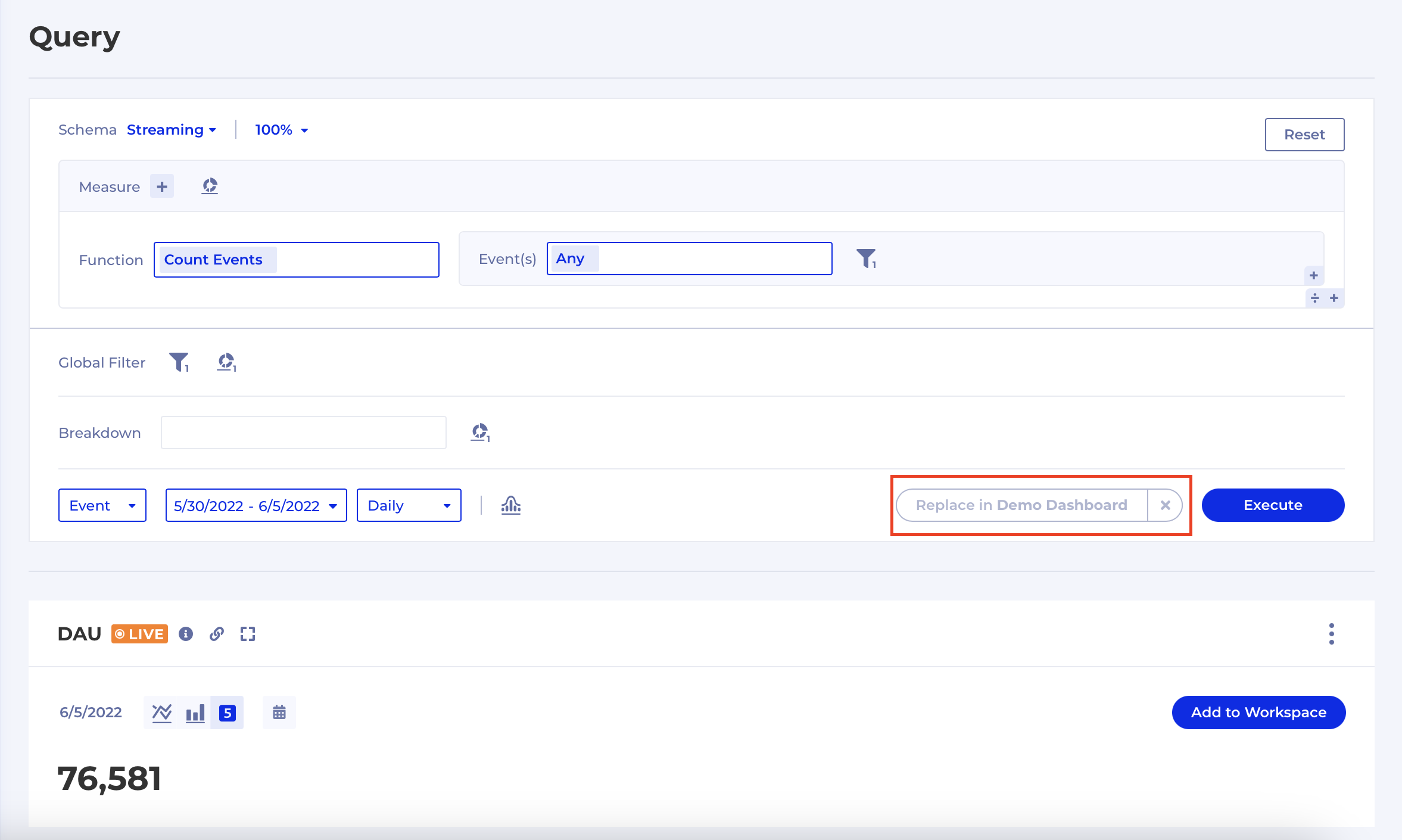
Executethe analysis to create a new Chart.
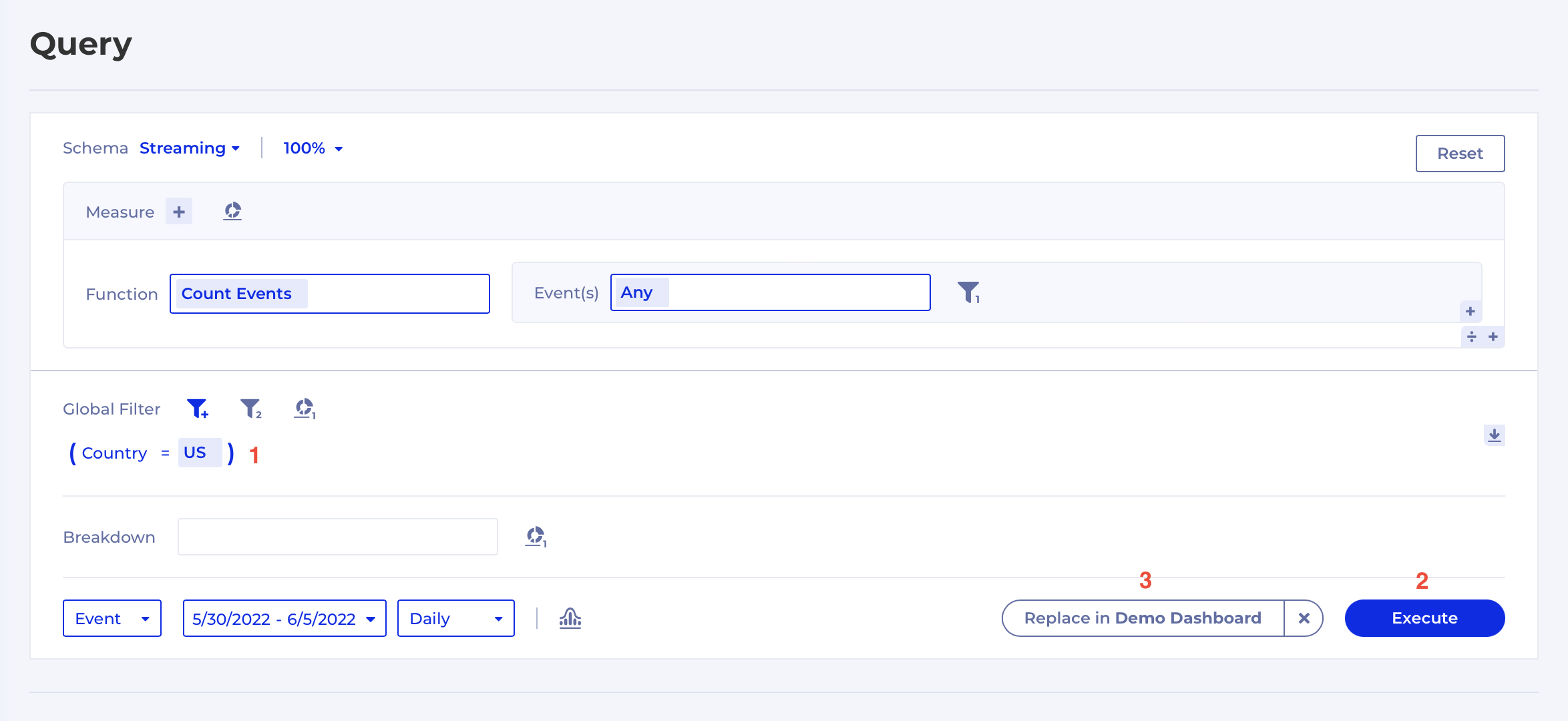
- Once you are happy with your new chart click the
Replaceto automatically replace the Chart in the Dashboard.
Disable Events from Data Dictionary
When an Event has become obsolete or you want to disable it temporarily because of issues with the data quality you can now go to Data Dictionary and disable it from the event's context menu:
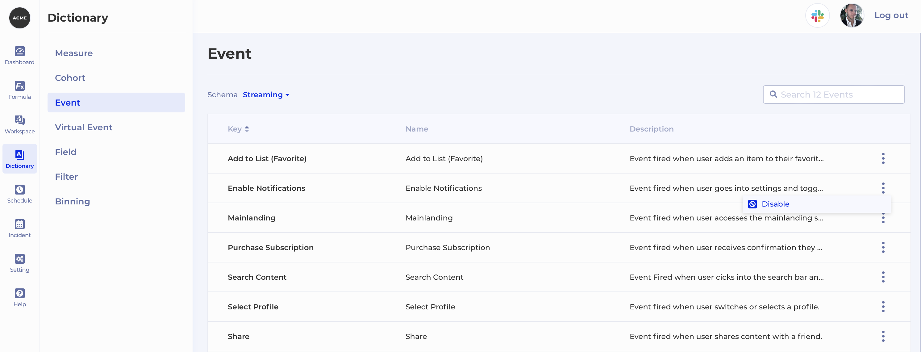
Once an event is disabled it will appear greyed out in existing analyses that reference it:
In the example above, if you try to re-execute the analysis containing this disabled event there will be no results.
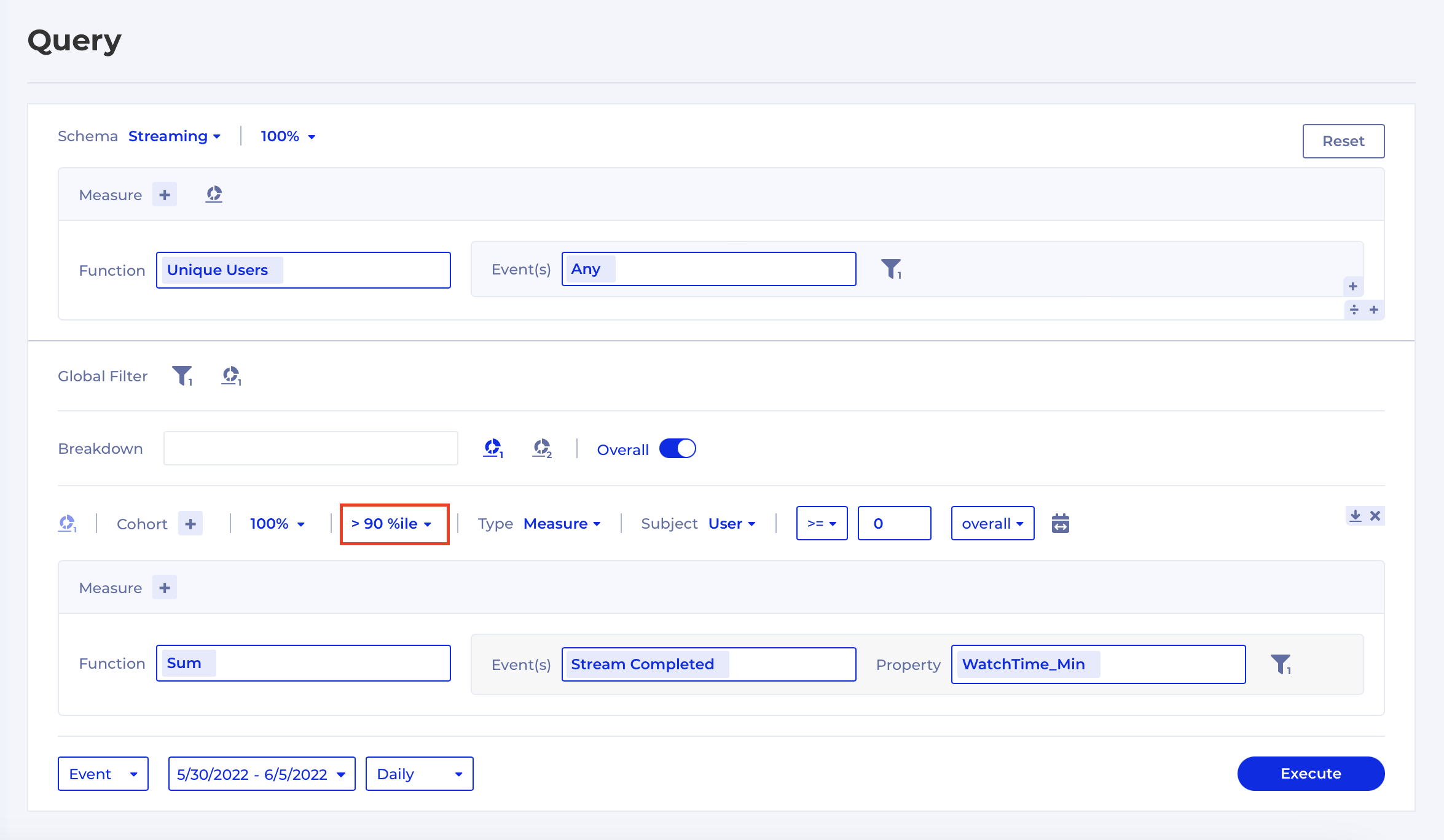
Percentile filter for Measure and Query based Cohorts
Introducing an enhancement to Measure and Query based Cohorts which allows you to segment users based on what percentile of the measure they fall in. In other words, you can now express statements like: "I want to define a Cohort of the top 10% of users by their watch time".
To access this additional filter you must select the Measure or Query Types.
This is how it would look like in Kubit: