Improved
R280 - 2023-01-05
January 8th, 2023 by Stefan Enev
- Improved display of labels on the X axis for all charts
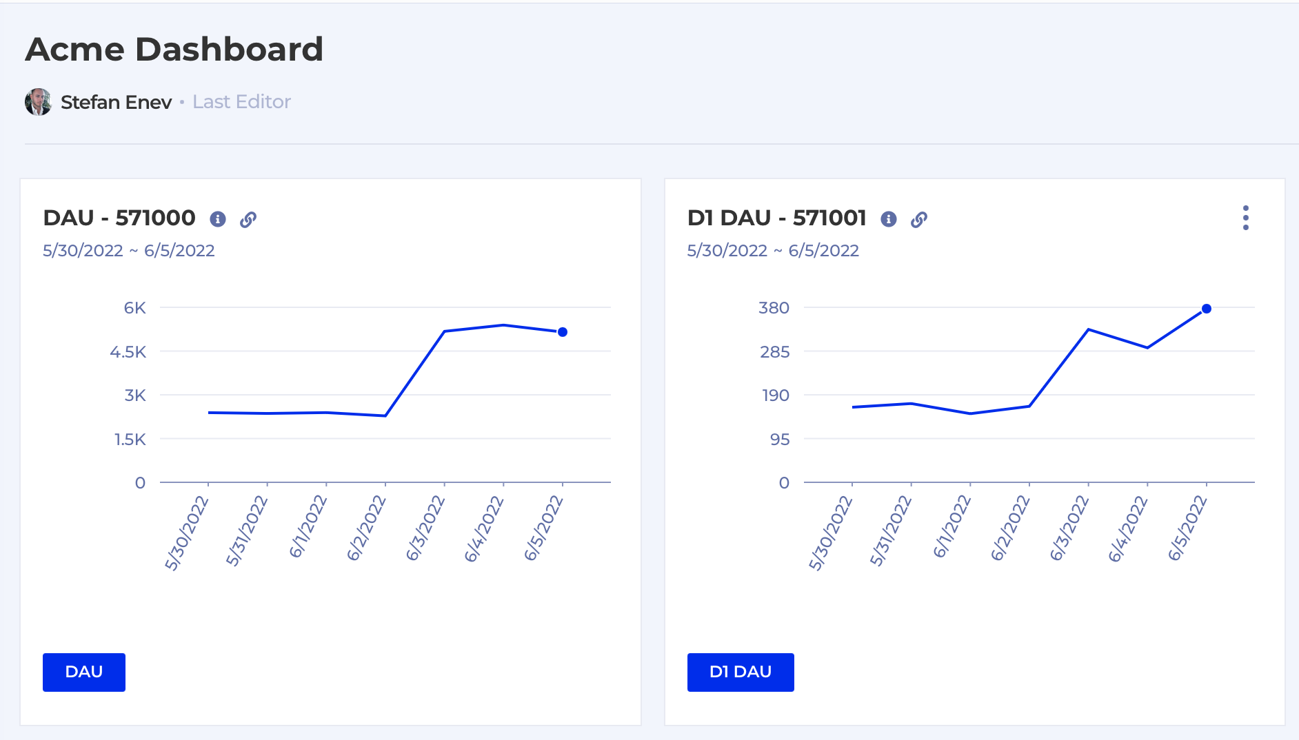
Whenever there's too many data points on the X axis Kubit will now display the labels slightly tilted so they don't overlap and are still readable. This applies to all charts and in all places - Dashboard, Formula, KPI, Workspace, here's a couple of examples:

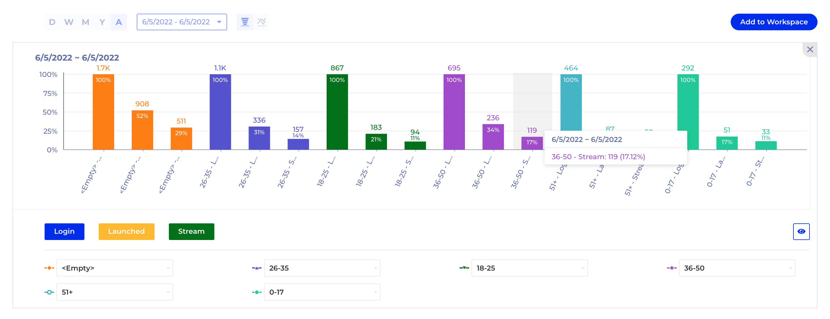
In this Funnel example with multiple Breakdown Groups selected simultaneously the label is too long to be displayed in full, however, you can still see the full label on hover.
