UI Enhancements & User Experience
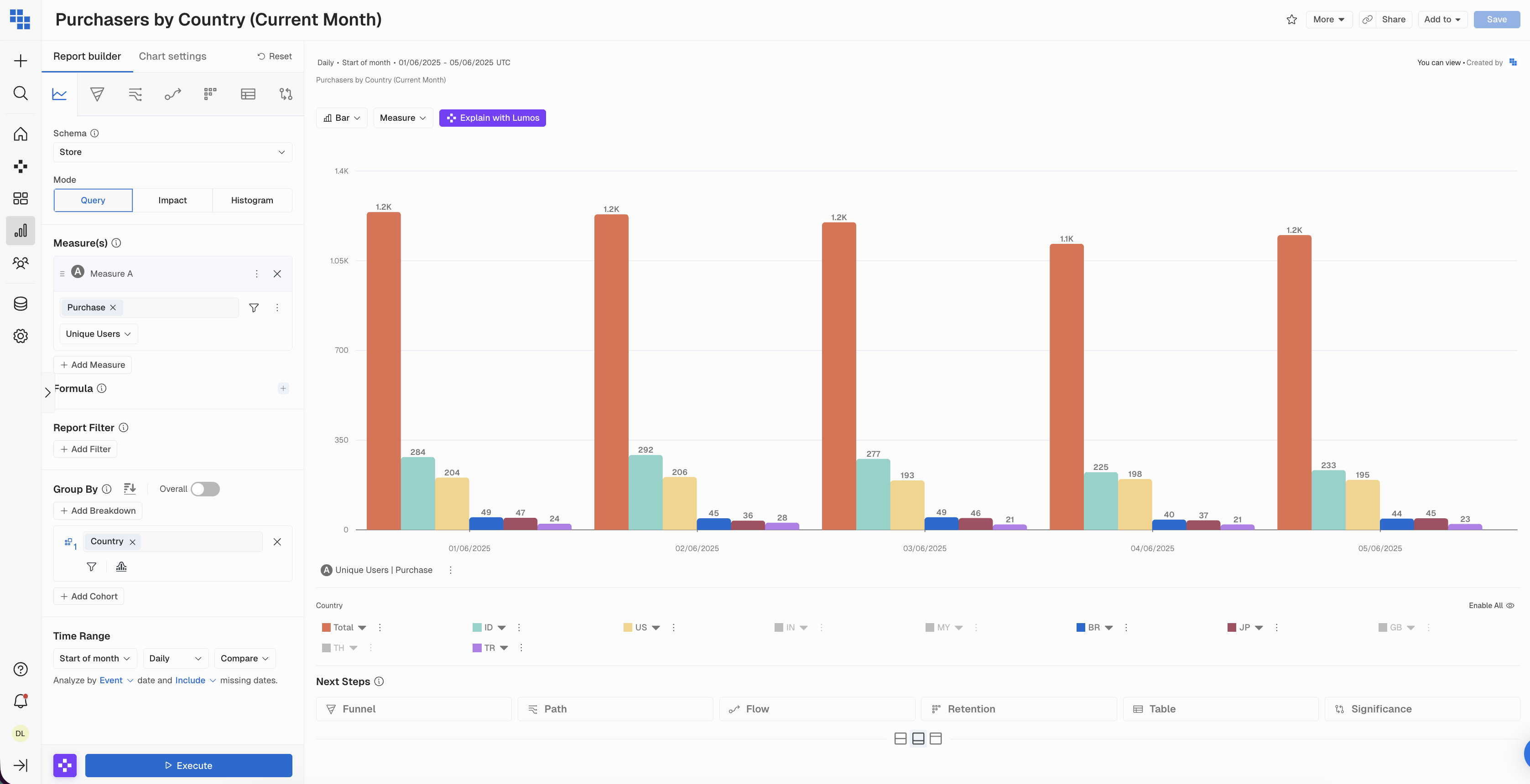
Before: Charts weren't responding well to different screen sizes, resulting in cutting off content.
Now: Charts now utilize dynamic scaling and responsive containers across different displays, from laptops to large monitors.
The result: Ensuring all content is visible including labels, legends, and data points. Better visibility of complex charts and large data tables. Reduced need for scrolling.
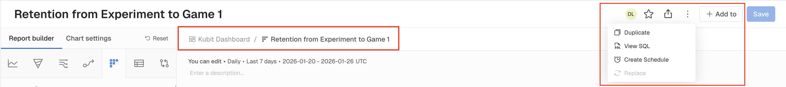
Before: Report & Dashboard headers needed improved information density and cleaner visual hierarchy due to inconsistency with modern UI patterns.
The result: The redesigned sticky header moves the report description into view and simplifies action buttons into cleaner icon-based controls. You can now navigate, favorite, and share reports faster with less visual clutter.
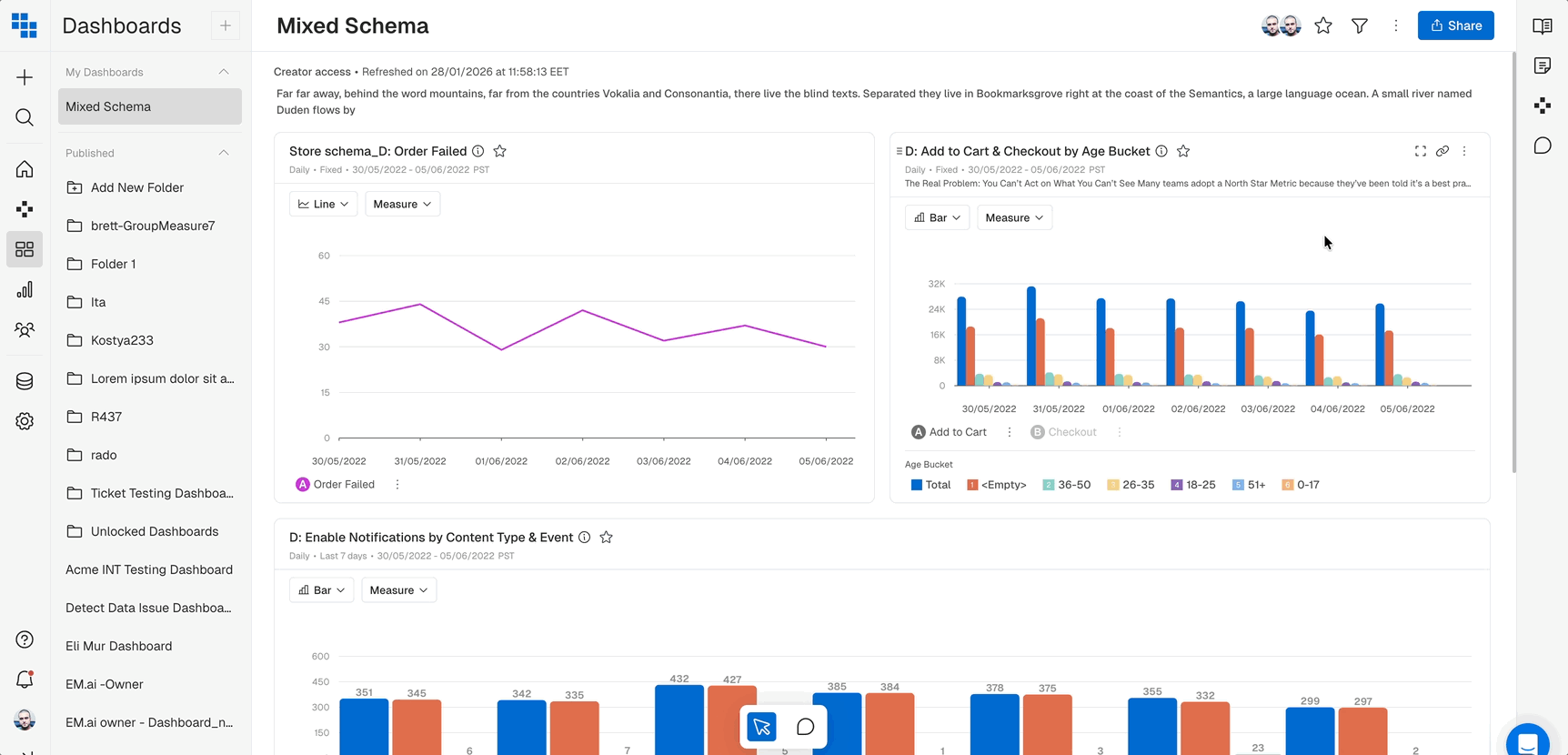
Before: When clicking the filter icon while scrolled down on a dashboard, users had to manually scroll back up to see the filter panel.
The Result: Clicking the filter icon now automatically scrolls the page to the top, so you can immediately start working with your filters without extra navigation.
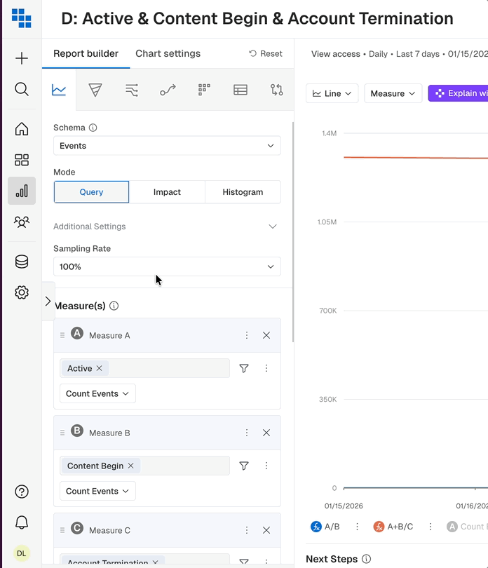
Before: Dropdowns with input fields (like Sampling Rate) stayed open while scrolling the builder, creating visual confusion and potential misclicks
The result: All dropdowns now close consistently when you scroll, keeping the interface clean and predictable.