Improved
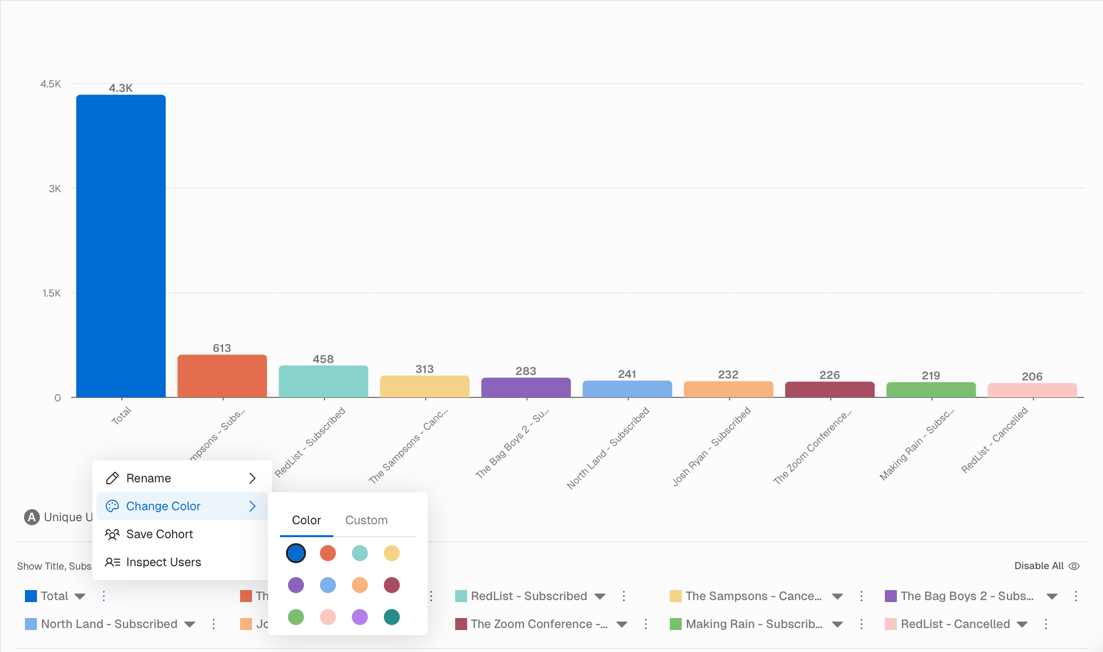
🎨 Chart/Report Colors Enhancement
October 30th, 2025 by Stefan Enev
We enhanced the color scheme within all Charts and Reports and expanded the palette for more granular customization. More colors mean better visual distinction between data series. Create professional looking reports that align with your brand. Greater flexibility in how you tell your story visually.