Dashboard
Keep track of your metrics
Introduction
The Dashboard is a place where you can visualize results from multiple analyses simultaneously. The charts can be refreshed daily for others to get a quick overview of their key metrics. You can create multiple dashboards which contain different charts. All the charts are interactive.
Show in Report: hover on the info icon of a chart will show you the Info Popup. You can click onShow in Reportto load the chart in Report view and conduct further analyses.Refresh the Dashboard: force re-execute all analyses on the Dashboard.Create New Schedule: create a repeated schedule to execute the dashboard and email the results.Existing Schedules: a quick link to all existing Dashboard schedules.Copy Dashboard Link: copy the URL to this dashboard.Edit Dashboard: use drag-n-drop to rearrange the charts. Make sure you clickSavenear the top right when you are done.Clone Current Dashboard: clone this dashboard into another one.Delete Dashboard: removes the Dashboard forever.
Dashboards are visible to and can be edited by everyone.

Dashboard Constraints
- Only charts created in Query, Funnel or Retention can be added to a Dashboard.
- There is a maximum date range for Charts on the Dashboard. When you add a Chart that uses a date range which is beyond those limits, the date range is automatically adjusted down to the maximum. The maximum length of the date range for any analysis that is put on a Dashboard depends on the time unit used for the analysis. Here are the limits:
| Time Unit | Maximum date range (Days) |
|---|---|
| Days | 60 |
| Weeks | 90 |
| Months | 180 |
| Years | 365 |
Editing Dashboards
Add charts to a Dashboard
There are 2 ways to add a chart to a Dashboard. Once you have executed a Report in Query or Funnel You can:
- Add the Chart to an existing Dashboard. There is a shortcut button
Add & Gowhich leads you directly to the Dashboard once the chart is added. - Create a new Dashboard from the current Chart. If you want to stay and create more Measures, you can just use the
Addbutton to add the chart to the Dashboard and then go to it later to arrange its layout.
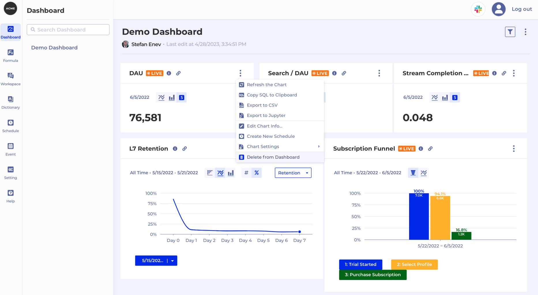
Delete charts from a Dashboard
To delete a chart from a Dashboard open the Chart's Context menu and select Delete from Dashboard. Select Delete from the Delete Confirmation dialog box to confirm.
Change the layout of the Dashboard using drag-n-drop
By default Charts are added to the bottom of the Dashboard. From there you can use Edit Dashboard from the Context menu to enter Edit mode. Once in that mode you can drag-n-drop to move charts up and down or put them together on the same line as shown below.

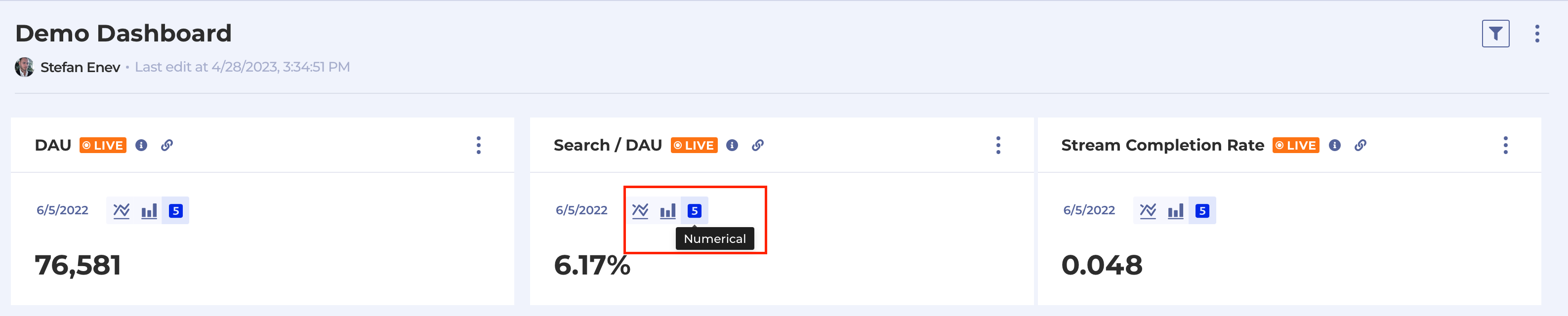
Display Measures created in Query as Numbers instead of lines
You can tell the Dashboard to display key Measures created in Query as Numbers. When a chart created in Query is added to the Dashboard it is shown displayed for the date range of the analysis with date range constraints applied. When you want to display the result of a Chart as a single Numeric metric Kubit selects the number for the last time unit of the period. You just need to click on the Numeric chart type.
Note
You cannot display charts that have Breakdown configured as one numeric value, as there is not a single number to pick.
Note
When you modify a Compound Measure chart on the Dashboard Kubit always uses the Result and cannot be told to show the value of any of the constituents of the Compound Measure.
Change/Edit a Chart on the Dashboard
You can modify the Query Settings of each Chart by following these steps:
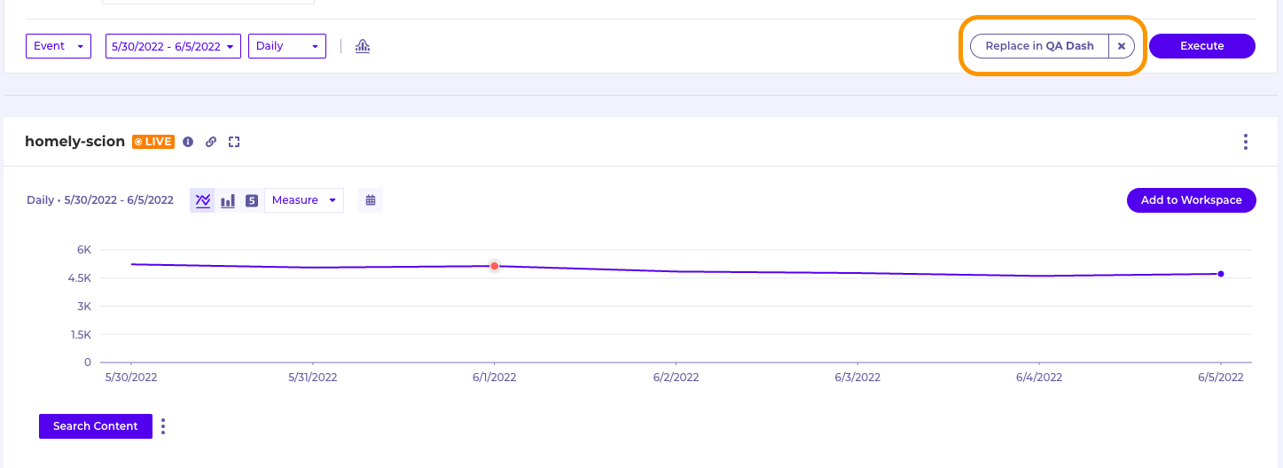
- Click the "i" icon on the Chart you'd like to change/edit
- Click "Show in Report" to open the Chart in a new tab
- Make any modifications you'd like to this Chart (add, remove or change the query definition/filters etc.)
- Execute your new Chart and confirm you have what you need
- Click the "Replace in..." button next to Execute, this will replace the original Chart on your Dashboard with the new one you've just created
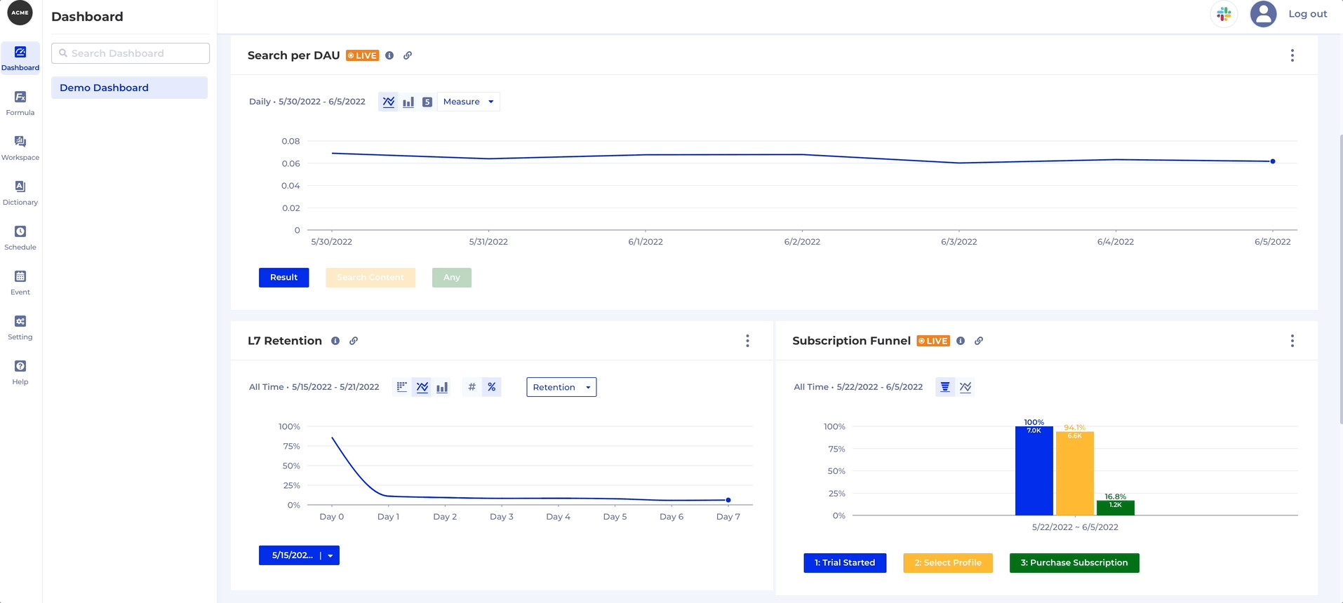
You can modify the Chart Settings of each Chart directly on the Dashboard, namely the:
- Chart Type
- Y-axis settings
- Measure Format
- Measure Display
Here's how you change the Chart Settings on a Dashboard:
Dashboard Schedules
Create a Schedule to distribute a Dashboard snapshot over email
We understand that many knowledge workers' schedules could become extremely busy and they would rather have the data come to them instead of them logging into different systems to get to the data that they need. To make life easier we have the Schedule feature, which allows you to refresh the Dashboard at a pre-set time and send the result over email.
- Select
Create New Schedulefrom the Dashboard's Context menu. - Configure
Name,Description,Recipient(s)andRecurrence. - Hit
Createand you're set!


Note
The
Execution Timeis in your timezone for convenience.
Change Dashboard date range from one place
This feature allows you to compare how the metrics and charts on a Dashboard changed from one time period to another. All you need to do is open the same Dashboard in 2 separate windows on your screen, put them side by side and tweak the date ranges on each.
You can do that from the Date Selector which was added on the top right of Dashboards, by default it's greyed out to indicate it is not applied since Dashboards show the charts with the date ranges that were applied at the time they were added.

Note
Once you apply this date range it applies to all charts on the Dashboard. For example, if you had a Query showing you data for the last 30 days, a Funnel showing the last 1 day and a Retention chart showing the last week once you apply the new date range it will be applied on all charts.
Here's two instances of the same Dashboard side-by-side. The one on the left shows data for an earlier time period and I can see how the metrics and charts have changed over time:

Share a Dashboard with modified date range
Note
The date range you select does not modify the Dashboard and you cannot save the Dashboard for that date range!
However, you can obtain a permanent link to the Dashboard with modified date range to share with your coworkers. Note that when they open it they'll see the date picker reset to default (greyed out and showing latest dates), but they will still see the Dashboard with the correct date range applied. Here's how:

Export a Dashboard
You can export a Dashboard to PDF from the Context menu on the top right:

Updated 3 months ago